How To Make Lava Lamp-Style Blob Animations With HTML and CSS
No JavaScript needed with the power of SVG filter elements
Published on
Sep 20, 2022
Read time
3 min read
Introduction
One of the projects I’m working on involves applying game mechanics in an unexpected setting; my team and I were experimenting with ways to bring the idea to life. One idea we had was to represent experience points as some kind of liquidy purple plasma.
Our design team wanted circular globules to change form as they stretched and squashed mid-flight. Our challenge was to achieve this in a performant way, using just HTML and CSS.
As I was trying to work out an approach, I stumbled upon this awesome lava lamp code sample that achieves a similar effect — it’s super fast, and it’s surprisingly simple! In this article, I’ll discuss how the effect works and how I applied it to my project.
SVG Filter Elements
The effect works because of a combination of several SVG filter element: feGaussianBlur, feColorMatrix and feBlend.
feGaussianBlur— blurs the input image by an amount specified in thestdDeviationprop.feColorMatrix— allows us to transform the colours in our SVG. Here, we’re using it to affect the alpha (transparency) channel of the SVG, so that only the most opaque colours are visible.feBlend— defines how our filter elements will be blended with the blob CSS. We’ll use the defaultmode, which is"normal".
The effect work because when two elements of the same SVG get close enough, the blur kicks in and fills the gap. So how can we adapt this for our use case?
Building the Blobs
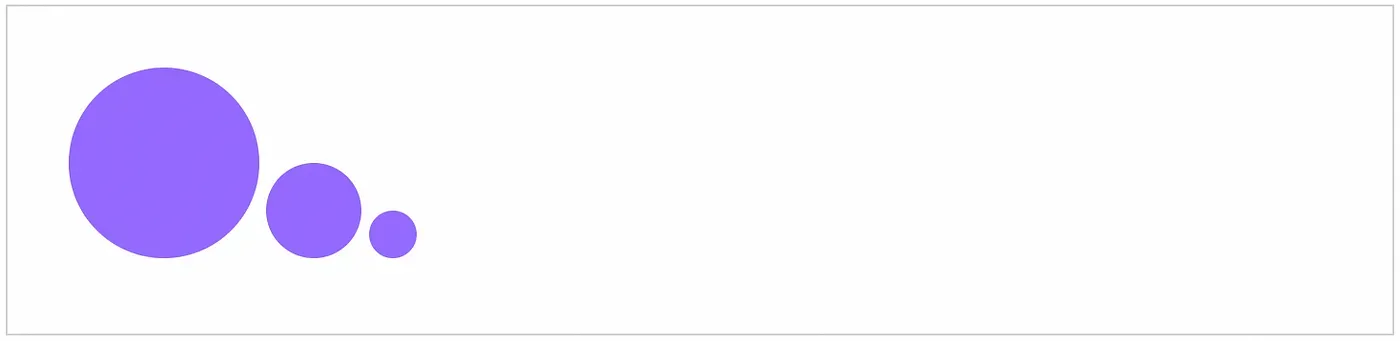
My solution was to use two circles — a larger one and a smaller one — and animate them independently. The circles should begin on top of each other, so only the larger one can be seen.
The HTML looks like this:
<div class="wrapper">
  <div class="blob"></div>
  <div class="blob"></div>
  <div class="blob"></div>
</div>
The CSS is also pretty straightforward. The most unusual element is using the filter property to point to our SVG filter, which we’ll create next.
.wrapper {
  filter: url("#plasma");
  position: absolute;
  height: 100%;
  width: 100%;
  top: 0;
  left: 0;
}

.blob {
  border-radius: 50%;
  position: absolute;
  background: #956aff;
  bottom: 10%;
}

.blob:nth-child(1) {
  width: 100px;
  height: 100px;
  left: calc(50% - 100px / 2);
  animation: blob-one ease-in-out 4s infinite;
}

.blob:nth-child(2) {
  width: 50px;
  height: 50px;
  left: calc(50% - 50px / 2);
  animation: blob-two ease-in-out 4s infinite 0.1s;
}

.blob:nth-child(3) {
  width: 25px;
  height: 25px;
  left: calc(50% - 25px / 2);
  animation: blob-three ease-in-out 4s infinite 0.1s;
}
Animating the Blobs
For the animations, we want our three blobs to move slightly different distances at different times. This took a bit of trial and error; I tweaked the values until I found something that looked natural.
@keyframes blob-one {
  0%,
  100% {
    transform: translateY(0);
  }
  50% {
    transform: translateY(-524px);
  }
}

@keyframes blob-two {
  0%,
  100% {
    transform: translateY(0);
  }
  50% {
    transform: translateY(-541px);
  }
}

@keyframes blob-three {
  0%,
  100% {
    transform: translateY(0);
  }
  50% {
    transform: translateY(-646px);
  }
}
See the Pen Plasma Blob (Without Filter) by Bret Cameron (@BretCameron) on CodePen.
Adding the Filter
Now we can create the filter, making our circles look like they are getting absorbed into one another.
Back to our HTML.
<svg xmlns="http://www.w3.org/2000/svg" version="1.1">
  <defs>
    <filter id="plasma">
      <!-- Our filter elements will go here -->
    </filter>
  </defs>
</svg>
First, we want to add our blur. We can tweak the stdDeviation to get a level of blur we’re happy with.
<feGaussianBlur in="SourceGraphic" stdDeviation="15" result="blur" />
Next, the colour matrix. If color matrices are new to you, I recommend checking out the relevant MDN article. There’s also a good article about color matrix transformations by Microsoft.
We only want to affect the SVG’s alpha and white (offset) channels, which means we only need to change the final two values of the matrix.
As ever, the numbers can be tweaked to get something that looks natural.
<feColorMatrix
  in="blur"
  mode="matrix"
  values="1   0   0   0    0
          0   1   0   0    0
          0   0   1   0    0
          0   0   0   18  -7"
  result="plasma"
/>
Lastly, adding the blend element defines how our filter will blend with our blobs:
<feBlend in="SourceGraphic" in2="plasma" />
Altogether, our final SVG looks like this:
<svg xmlns="http://www.w3.org/2000/svg" version="1.1">
  <defs>
    <filter id="plasma">
      <feGaussianBlur in="SourceGraphic" stdDeviation="15" result="blur" />
      <feColorMatrix
        in="blur"
        mode="matrix"
        values="1 0 0 0 0 0 1 0 0 0 0 0 1 0 0 0 0 0 18 -7"
        result="plasma"
      />
      <feBlend in="SourceGraphic" in2="plasma" mode="overlay" />
    </filter>
  </defs>
</svg>
We now have an organic-looking plasma animation that is extremely performant because it doesn’t rely on any JavaScript!
See the Pen Plasma Blob by Bret Cameron (@BretCameron) on CodePen.
Related articles
You might also enjoy...

Simple React Scroll Animations With Zero Dependencies
React Hooks, CSS, and the Intersection Observer API
3 min read
Sept 2022
Create Interactive Visuals with JavaScript and HTML5 Canvas
How to Make Two Animated, Interactive Hero Sections
12 min read
Sept 2019
How To Automatically Resize an iframe
Use HTML and Vanilla JavaScript to create dynamic iframes, acting as if they’re part of the parent window
21 min read
Jul 2019